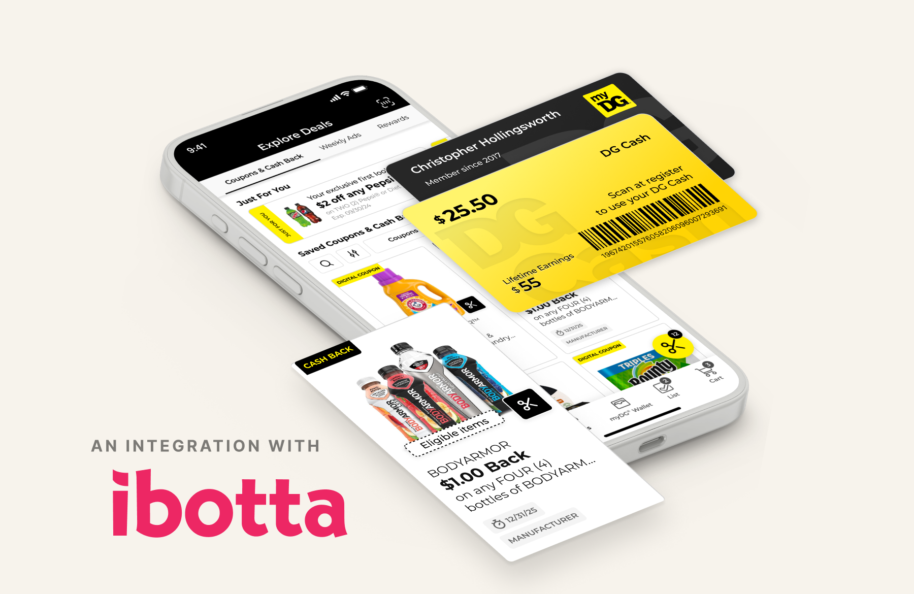
First-in-channel Ibotta partnership at Fortune 500 retail scale · myDG Cash Back
Dollar General needed a modern rewards mechanism to compete without fracturing the deals experience millions already relied on. I led UX for the white-label Ibotta integration: cash back co-mingled with coupons in a single gallery, same patterns, no seams. It put $9M back in customers' pockets in year one and grew deal clips 191% year over year.
Cash Back offers, DG Cash, and the Ibotta partnership
Role
UX team lead & design
Team
5-person cross-functional
Timeline
Jan – Jul 2023 · two-phase rollout
Platforms
App · Web · POS
01The problem — competing without a modern rewards mechanism
Dollar General needed more than coupons. Larger competitors had established cash-back programs that drove both engagement and known-customer identification. DG had 20,000+ stores, 12 million monthly active app users, and a deeply loyal, value-conscious base. What it did not have was a modern rewards mechanism to match. No one in the discount channel had made this move yet.
The timing sharpened it. Inflation was running hot, SNAP emergency allotments had ended, and DG's core customers were stretching harder than ever. The challenge wasn't just building a feature. It was shifting how a customer base accustomed to paper coupons would engage with a new category of value, without fracturing the deals experience they already relied on.
02The approach — native integration, not a bolt-on
I led UX for the white-label Ibotta integration. That single decision defined the whole project. Rather than embedding a partner experience inside DG's app, we designed from the customer backward: cash back offers would live alongside existing coupons in a single, co-mingled gallery. Same interaction patterns. Same visual language. No seams.
Thousands of survey responses shaped discovery, and they surfaced the insight that customers didn't sort deals by type. They sorted them into useful and not useful. That shaped every decision downstream.
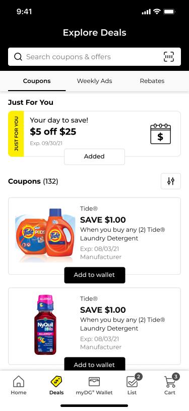
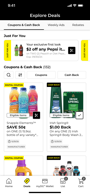
Fig. A — Coupons only → co-mingled deals
Before — coupons only; no cash-back mechanism, declining differentiationAfter — Coupons & Cash Back in one entry point, search-first, clip everything from a single feed
Why UX drove revenue here: the Ibotta Performance Network is pay-per-sale. Advertisers only pay when a customer actually buys. That makes the clip-to-purchase funnel the literal revenue engine. Every decision that improved discoverability, clip rates, or redemption friction moved the business model directly. Design wasn't decorating the feature. It was the mechanism that made the economics work.
03The process — discovery, taxonomy, iteration
The core question: how do you make two deal types coexist without confusion? Coupons require clipping. Cash back requires purchasing. Different mechanics, different mental models. Customers expected a single, unified savings experience. The work resolved into four moves:
Taxonomy design. Separate cash back from coupons in the data model, present them together in the UI. Clean categories, shared visual language.
Gallery architecture. A co-mingled, searchable, filterable gallery; card layouts and offer hierarchy tuned for clip rate.
Wallet integration. A DG Cash redemption pathway so earnings felt immediate and accessible, not buried.
Clip-rate optimization. Iterated on deal presentation, savings-callout prominence, and interaction patterns with Ibotta's team, then shipped.
The decisions that mattered:
Co-mingled, not separate tabs. Research showed customers think in products and brands, not deal categories. Separate tabs would have forced a mental model that didn't exist.
Search-first discovery. With hundreds of offers live at any time, findability drove clip rates more than presentation.
Native feel over partner branding. The white-label SDK allowed customization; the real work was the UX layer. Every interaction used DG's design language, so customers never felt they'd left the app.
Closed-loop DG Cash. Earned value redeems only in-store at DG. A deliberate call: value stays in the ecosystem and drives repeat visits, and the wallet had to make that feel like a benefit, not a limit.
Anti-stacking, made transparent. Coupons and cash back can't both apply to one item; coupons take priority. The gallery made that clear rather than confusing, always defaulting to the customer's best deal.
04Results — proof at scale
This became one of the highest-impact consumer-facing features in Dollar General's digital history. Partner integration, native design, and operational scale validated the approach at every level.
435M
Total deal clips across the platform
$9M
Earned by customers in year one. Real savings, real loyalty.
191%
YoY clip growth. Accelerating, not plateauing.
209%
Redemption growth, year over year. Clips that became purchases.
Figures are Dollar General program results, Jan 2023 to Jan 2024. Partnership publicly announced July 2023.
The wallet became the home for DG Cash. Its success is also what exposed the architecture gap underneath, and that gap became the Wallet redesign a year later.See the myDG Wallet case study →
05Key learning — make the feature disappear
Partner integrations succeed when they feel native. The taxonomy decision, cleanly separating deals from coupons in the data model while presenting them together in the UI, made the Ibotta partnership feel like it had always been part of Dollar General. Customers didn't know it was powered by a partner. They didn't care. That's the bar.
The lesson extends past this one partnership. Every integration, acquisition, or feature expansion should face a single question: does it feel like it belongs here? If the answer is no, the experience is failing, regardless of how the numbers look.
"Design isn't about the feature. It's about making the feature disappear into the product."