Everybody wanted Wallet fixed. There was nothing to fix — there was something to architect. This is the thesis, the disagreement I lost, and the system that's still absorbing new programs two years later.
Shipped — myDG Wallet, June 2024
Role
Embedded design leadership, DG digital org
Team
8-person UX team — design + research
Timeline
Q1–Q2 2024 · launched June 2024
Scale
12M+ MAU platform
01The problem — nobody owned it
Wallet had grown one feature at a time — clipped coupons in one tab, DG Cash balance in another, the barcode buried, Saved Deals stranded on the shopping list. Each addition was reasonable in isolation, incoherent as a whole. Eight features across six screens. Multiple orgs, multiple PMs, nobody owning the surface. Engagement declining double digits with no sign of stabilizing — while the business kept asking "can you just fix Wallet?"
What made it urgent: Cash Back was working. I'd led UX for that integration the year before — DG was the first retailer in the discount channel to join the Ibotta Performance Network, 20,000+ stores. It added a real value layer, and its success surfaced the gap underneath. The feature I'd shipped is what exposed the architecture problem.
My product partner brought the decline data. Customers couldn't answer the most basic question: what do I actually have here?
FIG. A — THE FRAGMENTATIONONE WALLET, SIX ANSWERS
8FEATURES
6SCREENS
MULTIORGS / PMS
0COHERENCE
where the value actually lived — six destinations, no connecting logic
Wallet tab
Clipped Coupons
Cash tab
DG Cash balance
Cash Back
Rewards screen
Rewards
Shopping list
Saved Deals
Account settings
Payment Methods
Order History
Buried
Barcode
Cash Back was the one that worked — its success exposed the gap underneath.Barcode = the moment that matters
Eight features spread across six destinations. The picture argues the point.
02The thesis — the call the story turns on
Wallet was an architecture problem, not a features problem.
No single feature was failing. Six screens were splitting one mental model, and users never got a complete answer to "where's my money?" Engagement drops are often design problems, not user problems.
"The user's mental model is the only spec that matters. A PRD that contradicts it is wrong even if it ships."
03The exploration — how the card stack got found
Three inputs shaped the thesis: the decline data (fragmentation as root cause, not missing features), user research (people think in terms of "my stuff" — six screens meant six partial answers), and AI-augmented exploration — we surfaced directions in days instead of weeks, which let us pressure-test the architecture before asking anyone to commit roadmap to it.
The working loop: brain-dump the problem space → AI synthesis → rough builds → creative direction against them → Figma craft → handoff. Cost-to-restart was effectively zero, so we explored ten rough directions instead of defending one — then boarded the five worth arguing about, killed four with reasoning, and shipped the survivor.
The honest footnote: this was early 2024 — Airtable AI to synthesize research, Uizard and Galileo to spin layouts, years before those tools matured. The instinct was there before the tooling caught up. But the tooling only gave us volume, not judgment.AI generated the options — it couldn't tell us which one mattered. The card stack came from creative direction applied to that volume. That part was ours, not the model's.
FIG. B — THE KILL-PASSTEN EXPLORED · FIVE BOARDED · ONE SHIPPED
10EXPLORED
5BOARDED
1SHIPPED
kills shown in the order they happened — no retroactive editing
A
The Feed
Chronological stream. Recency is the wrong sort key for value — the offer expiring tonight beats the one clipped this morning.
KILLED
D
The Locker
Categorical tabs. Research said customers think "useful vs. not," not in deal categories — the org chart leaking into the UI.
KILLED
B
The Dashboard
Analytics overview. Reports on value instead of delivering it — flatters stakeholders, burdens the shopper in the aisle.
KILLED
C
The Assistant
Chat-first wallet. Conversation adds latency to a glanceable task — nobody interrogates their wallet in a checkout line.
KILLED
E
The Stack
Value-sorted card stack, barcode as the persistent anchor. Matches the mental model — a wallet is a stack of cards. Every upstream interaction pays off at the register.
SURVIVOR
Five boarded, four killed with reasoning. AI generated the volume; the kill decisions were ours.
04The system — six screens became one card stack
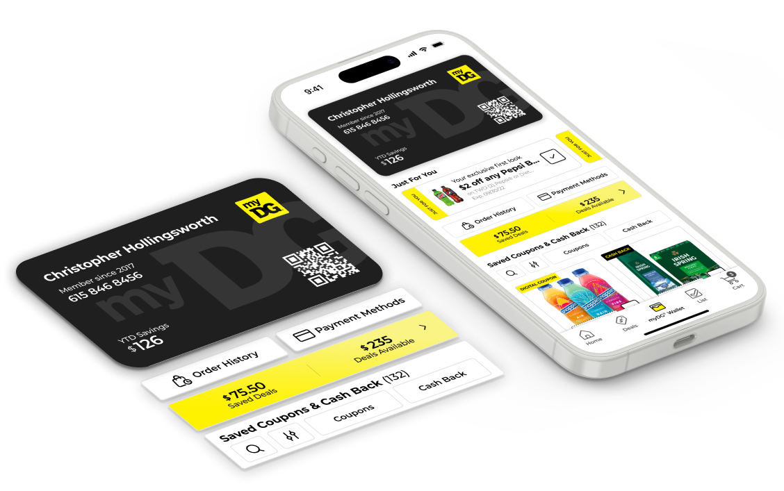
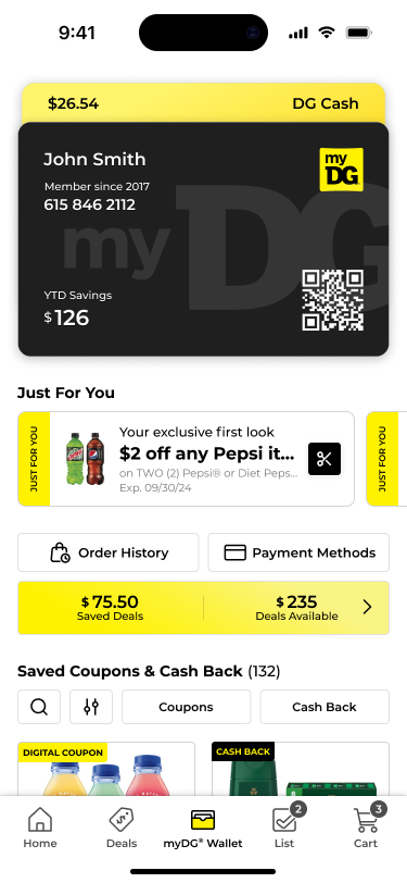
One mental model of money. Rewards, clipped deals, payment methods, and order history in a single system — a virtual card stack, barcode redemption at the register, a direct path from Wallet to checkout.
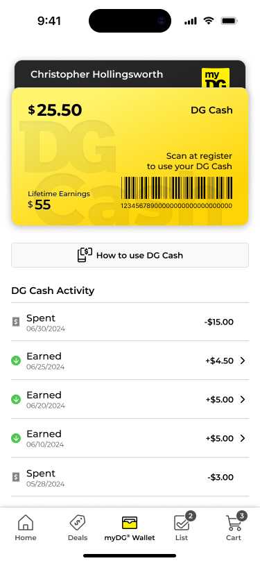
Two moments served — pre-shopping and in-store, one continuous flow.The barcode was elevated to the primary action.
What made it a system, not a redesign — three things:
It holds customer identity and credentials, so anything that authenticates a transaction can live there.
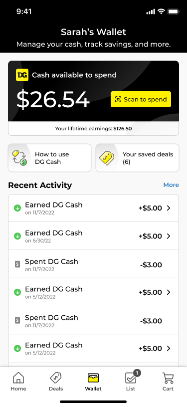
It tracks earnings and spending for any deal program — Cash Back and Rewards land in the same balance architecture.
The card-stack pattern is additive by design — when Rewards shipped, we didn't invent a new screen, we added a card variant. Engineering built once, customers learned once.
Fig. C — Six screens, one card stack
Before — value scattered across screens and patterns, the barcode buriedAfter — one card stack, value-sorted, states made visible (130%+ YoY recovery)The barcode elevated — redemption as the persistent anchor action
05Landing it — alignment, and the disagreement I lost
Nobody owned Wallet, so alignment had to be built. My product partner and I made a paired argument — her data, my architecture — presented as one case to Product, Engineering, and the Chief Digital Officer.
The signal it was working: teams stopped arguing about where features should go and started arguing about whether features fit the model. Same energy, better question.
The disagreement
A customer's saved deals lived on completely different technologies — coupons, offers, and just-for-you on one, cash back on another, rebates on a third. I pushed to unify them into one wallet. The moment that mattered was in-store: most of our customers shop in the store, and at the register it's all about the wallet. If they thought they'd clipped a coupon and it didn't ring up, they had to hunt across screens.
The call was deferred — and the reasoning was sound: the cost was high and largely unknown, the technologies genuinely different, the capability not there yet.I argued for the customer with evidence, not a louder voice. Then I respected the call.
Eight months later the architecture won on its own evidence, and we unified it. That became the Unified Wallet that stands today — slower than I wanted, more durable because it wasn't forced.
Where the model got tested
The model tempted us to pull everything in — but payment methods and order history belong to the account, not the wallet. So we surfaced access through a slide-in drawer and kept their home in settings. The architecture drew that line, not politics. That's when I knew the thesis held under pressure.
06Results — then it started absorbing
130%+
YoY engagement growth — the decline reversed
40%
Faster offer comparison — card stack vs. list, 3+ offers at a glance
28%
Lift in relevant deal discovery, via filter discovery
6→1
Screens consolidated into one system
3–4min
Average session — high intent; time-to-value was the core metric
0
New features added — same capabilities, new architecture
Then the system started absorbing. Cash Back lived inside it from day one. A year later Rewards plugged in — a re-imagined version of an earlier rebate-style program that never fully matured — without a single new primary screen. One component, three progress variants (dollar fill, item dots, trip counter), because how you earn it is the product. Engineering built once. The vision outlived the project.
FIG. D — WHAT IT ABSORBEDONE ARCHITECTURE · ROOM FOR THE NEXT
every program below landed in the same card-stack system — no new primary screen
Day oneIdentity & credentials
Day oneCash Back
AbsorbedClipped Deals
A year laterRewardsno new screen
DrawerPayment Methodsbelongs to account
Next · TBDThe slot the system leaves open
The card-stack system — identity, balances, redemptionBuilt once · learned once
The test of a system is what the next thing costs to ship.
Sourcing: figures are from the program's own reporting. Context, not causation — the app grew from 5M to 12M+ MAU across my four years; Wallet served that base.
07Key learning
"The discipline isn't adding features. It's building the system that absorbs them."
What I'd do differently: I'd bring engineering into the exploration earlier. We brought them a thesis to react to instead of a problem to shape. The instrumentation disagreement might have resolved in weeks instead of eight months if the people who owned the data plumbing had been in the room while the card stack was still clay. That changed how I run vision work now — engineering joins at the exploration stage, not the commitment stage.
I diagnosed a broken mental model at twelve-million-MAU scale. I didn't apply a framework.